
I have never been a fan of this cover. In fact, I pushed off reading it for about a year (even though my Goodreads insisted that I would love it) because I hated the look of it so much. But after manning up and picking it up from the library, Anna became my new favorite contemporary. My opinion of the cover, however, did not change.
First… how is it significant? All we see is a girl leaning over smiling at a boy’s arm, with the Eiffel tower in the background. My biggest problems would probably be…
- That doesn’t look a lot like Anna. The way that the girl on the cover is acting is super Un- Annaish. She’s smiling all flirtatious and bubbly, but do we remember how she actually met St. Clair? Not so smooth. Also, he had a girlfriend and she respected that. She was completely cool with being friends. Not so sure what’s going on in the picture… I would accept it if he were smiling back, but he just looks disinterested.
- Some of you may think that this is a ridiculous reason and I admit that it kind of is… but HIS ARM LOOKS SO GIRLY TO ME. It just doesn’t look right! Maybe I’m the only one who feels this way. But seriously, I can’t get over it.
- It just looks too simple and photoshopped, not at all as phenomenal as the book is. It would have been better it if were a bit more sophisticated. It just doesn’t properly capture what is inside of the book. WHICH IS AMAZINGNESS.
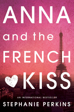
Now, let’s talk about this new cover…
I know I may be contradicting myself - well, no, I am - when I say that I love it for it’s simplicity. After all, up above I said that it looks too simple. But this is the right kind of simple. A gorgeous paris scene tinted pink, with the cover’s writing over top? I don’t have any problems with it. It may not be my favorite possible cover for the book, but I don’t have any real complaints. It has the right amount of sophistication, but still promises a cute and fluffy book.
And look at that gradient effect! Gorgeous!
So yes, in the end I am happy with the way that this cover change turned out. Good job to the people who designed this new cover, whoever you are! I absolutely adore it!
I really hate the first cover too. It's so cheesy, and just makes me cringe. I wouldn't be seen dead reading a book with that cover!
ReplyDeleteI also have a problem with the title. Anna and the FRENCH KISS? No thanks! That sounds really cheesy, and in my opinion, a little gross. I really wish it was called something else!
Great feature :)
-Denise @ confessions-of-a-book-addict.blogspot.com